Let one texture lead
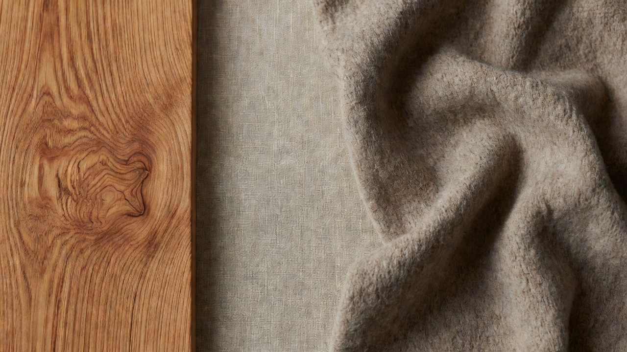
Cedar already contains pattern. Growth rings, knots and color transitions create movement even on a flat, undecorated panel. When that movement is strong, surrounding it with equally active stone, woven storage, patterned fabric and decorative objects can make the room feel crowded. A useful starting point is to choose the material that should attract attention, then give the others supporting roles.
This is not a rule that every interior must be pale or sparse. A richly colored room can still have a clear hierarchy. The distinction is between deliberate contrast and a collection of surfaces all asking for equal attention. Stand at the doorway and notice where your eye lands first. If every surface competes, remove or simplify one layer before buying another.
Change the scale of the pattern
Fine cedar lines can sit comfortably beside a broader textile weave because the two patterns operate at different scales. A tiny repeated print may compete more directly with narrow grain. Large knots introduce another rhythm again. Look at the whole piece rather than judging a hand-sized swatch in isolation: a subtle fabric can become visually active across a full sofa.
Direction also matters. Horizontal boards, striped cushions and a slatted blind may create a repetitive room even if their colors differ. Introduce a plain textile or a rounded form to interrupt that repetition. The aim is not to eliminate lines, but to make their repetition feel chosen rather than accidental.
Give each material a practical reason
Linen can provide a dry, irregular surface and relaxed drape, but upholstery performance depends on weave, construction and care instructions. Wool can bring dense texture and resilient pile, yet individual rugs vary in shedding, cleaning requirements and suitability for a household. Cotton, hemp and jute are not interchangeable simply because they are plant fibers. Ask what an item must withstand before choosing it for its appearance.
Mineral surfaces offer a different contrast. A plain ceramic vessel or quiet stone top can set off cedar’s lines without adding another woven pattern. However, porous stone may stain, rough ceramics can scratch furniture, and heavy objects need suitable support. Place protective pads where appropriate and check that a decorative object will not damage the finish beneath it.
A small sample kit
Bring together a wood offcut, the actual textile, a wall-color sample and one supporting hard surface. Keep them in the room for several days. Move them between daylight and evening light before deciding whether another material is needed.
Use sheen as a quiet contrast
Texture is not only about roughness. Light reflected from a smooth surface can be as visually active as a coarse weave. Several satin finishes can create a restless effect under spotlights, while an overly uniform matte palette may hide useful differences between materials. Compare how the surfaces behave under the room’s actual lighting rather than relying on a product photograph.
A small amount of metal or glass can provide a crisp counterpoint to cedar without making the room feel cold. Choose that contrast for a specific role: a reading lamp, a cabinet handle or a water glass. There is no need to repeat every accent across multiple objects. A material can belong because it is useful and well placed.
Build a palette around what already exists
Start with fixed elements: flooring, doors, window frames and large furniture you intend to keep. Cedar that looks reddish beside one floor may read more neutral beside another. Test pale linen, muted olive, chalk or charcoal as possible companions, but do not assume a named palette will suit every board. The actual undertones and the direction of daylight decide the relationship.
Mixing woods is possible. Often the easiest approach is to let one occupy the largest visual area while another appears in a smaller, more clearly defined piece. Similar-but-not-quite-matching woods can be harder to resolve than an intentional difference. Repetition of a simple shape or a shared low sheen can connect them without forcing their colors to match.
Finish by leaving something out
Once the main layers work, pause before adding accessories. An empty section of shelf can make the grain easier to appreciate. A clear floor edge can emphasize the softness of a rug. These spaces are not unfinished decorating; they provide the contrast that allows tactile materials to register.
Live with the arrangement and observe maintenance as well as appearance. If a basket sheds onto a bench, a rug catches a door, or a coarse cushion is uncomfortable, the texture is not serving the room. The strongest material palette supports ordinary use while giving the eye a few clear, enjoyable differences.